Elevator pitch
As the largest economy in the world, the US labor market is crucial to the economic well-being of citizens worldwide as well as, of course, that of its own citizens. Since 2000 the US labor market has undergone substantial changes, reflecting the Great Recession and the Covid Recession, but also resulting from some striking trends. Most interesting have been a remarkable drop in the labor force participation rate, reversing a nearly 50-year trend; the full recovery of unemployment after 2010 and its skyrocketing in 2020; and the little-known continuing growth in post-inflation average earnings.
Key findings
Pros
Unemployment is slowly recovering from its Covid Recession peak.
The job vacancy rate near the end of the Covid Recession is the highest since data have been collected and exceeds the hiring rate.
Labor force participation of men and women aged 20–54 has fallen, so that in 2020 the labor force has ten million fewer people than were expected in 2000.
Real earnings of the average- and median-earning full-time worker have risen.
Women’s wages have risen relative to those of men but remain somewhat below.
Cons
Even at full employment in 2019, long-term unemployment was much greater than at similar points of past business cycles.
Youth unemployment remains far above the adult average.
Labor force participation of men and women aged 20–54 has fallen, so that in 2020 the labor force has ten million fewer people than were expected in 2000.
Inequality is high, but unchanged over the last few years.
Wages of African-Americans remain far below those of white Americans and no higher than in the early 2000s.
Author's main message
In the aggregate the US labor market is recovering slowly from the Covid Recession. Unemployment is currently around 6%. Because this recession killed jobs of low-wage workers, real weekly earnings of full-time workers increased substantially during it. The difficulties lie behind the aggregates. Earnings inequality continued to rise, with the growth in earnings concentrated in, although not restricted to, workers in the upper half of the distribution of earnings. Even though labor force participation rates of people aged 55+ have been constant for the past decade, those of adult men aged 16–54 have dropped, continuing a trend. Surprisingly so too have those of women aged 16–54, sharply reversing the previous trend and easily offsetting increases in participation of older Americans. The earnings of African-American workers relative to whites’ earnings have not risen over this 20-year period. Those of Hispanics have, but both remain far below those of whites.
Motivation
Knowing the facts about a labor market is crucial for understanding labor market policy. Equally important is knowing which areas a country's labor market is doing well in and which ones poorly. This article provides these facts and discussions for a major country, the US.
Discussion of pros and cons
Aggregate issues
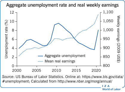
The US fell into recession in March 2001, experienced the Great Recession in 2007–2009 and the Covid Recession in 2020. Figure 1 shows the aggregate unemployment rate from 2000 through 2020. In it the shaded areas show the three recessions that occurred during this period, and each year is ticked at the January mark and with all statistics showing yearly averages (and thus marking July 1 of the year). The 2001 recession was shorter than most in the post-World War II period, lasting for only eight months; and it was also milder, with the seasonally adjusted aggregate unemployment rate rising only from 3.9% to 6.3% of the labor force, a smaller increase than had occurred on average in the previous 55 years of US business cycle history. The Great Recession was the deepest and longest in 70 years, with unemployment peaking in October 2009 at exactly 10%, just slightly below the postwar peak at the end of the recession in the early 1980s. This high unemployment was far exceeded in the Covid Recession of 2020, with unemployment peaking at 14.8% in April 2020, falling rapidly thereafter, then plateauing at what is considered a recession level of about 6%.
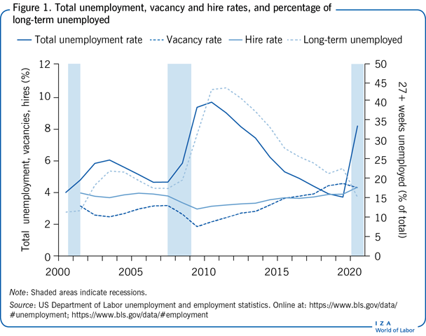
The Great Recession by some calculations was the longest and deepest in the post-war period, although it is possible to argue that the double recession of the early 1980s was longer. Regardless, compared to anything in the previous 25 years it was the most serious—deepest and most prolonged—cyclical decline that the US had seen in a generation. The unemployment rate did, however, fall steadily from 2010 through 2019. The Covid Recession briefly pushed unemployment to its highest rate since the 1930s, so that despite the rapid, albeit incomplete recovery, the average unemployment rate in 2020 was at recession levels and showed no sign of falling quickly.
After 2000 the US began collecting and publishing statistics measuring job openings (for short, vacancies), so that information on the counter-cyclical indicator, the aggregate vacancy rate, is now available. Figure 1 shows the entire annual time series of this indicator. It is doubtful that all vacancies are included, or, more important, that all hires fill officially declared job vacancies; nonetheless, the official vacancy rate is a good measure of employers’ unfilled demand for labor. The vacancy rate fell by nearly 50% during the Great Recession. Today, even though the economy is far from fully recovered from the Covid Recession, it is nearly at its peak since the data began to be collected and remains remarkably high considering how much unemployment exists.
As was true in the recovery from the Great Recession, in 2020 the rate of hires, also shown in Figure 1, equaled or exceeded the rate of vacancies. It is now above 4% per month, its highest over the entire period. Employers are having difficulties finding workers, and workers are having difficulties finding jobs, suggesting that there is a mismatch. Whether this is produced by the generous unemployment benefits offered during the Covid Recession, by employers’ refusals to increase wage offers at a time of high unemployment, or by other causes, is unclear.
The current recession-level unemployment appears ameliorated by the relatively small percentage of the unemployed who have been seeking work for 27+ weeks (defined in the US as the long-term unemployed). Of course, this percentage rose sharply near the end of the Great Recession (Figure 1); and, as in past recessions, mainly for mechanical reasons it only began to fall well after the business-cycle trough. What is disturbing, however, is that even in 2019 over one-fifth of all unemployed workers had been without work more than six months. This is a higher percentage than was observed at the cyclical peaks in 2000 and 2007. The sharp drop in long-term unemployment in 2020 is an artifact of the huge inflows of unemployed workers in spring 2020. It suggests that 2021 will see an increase in the share of unemployed workers who have been without work for 27+ weeks.
The aggregate unemployment rate is the product of the number of people experiencing unemployment in a given year times the average duration of unemployment of those who do become unemployed. The drop in long-term as a share of total unemployment makes it appear that the burden of no work is spread more widely than before. That is true early in recessions and recoveries from them. By the end of 2021 it will appear that the remaining unemployment, probably far above full-employment rates, will increasingly bear upon a relatively small group of workers. A disproportionately large fraction of the labor force will feel the burden of unemployment. And it is quite clear that social welfare is reduced when few people bear most of the burden of being out of work compared to when it is shared more widely [1].
Labor force participation—Aggregate, by gender and by age
Since the labor force by definition consists of the employed and unemployed—that is, it includes all those who are working or actively seeking work, focusing here on the labor force participation rate—the fraction of the population employed or unemployed—allows a discussion of employment. Figure 2 presents the aggregate US labor force participation rate since 2000. The participation rate fell by four percentage points between the cyclical peaks of 2000 and 2019; and, as in past recessions, it fell during the Covid Recession.
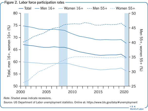
After over 50 years during which the aggregate participation rate rose, this decline surprised economists and other observers of the US labor market. Given the definition of the labor force, and given that the unemployment rate in 2019 was below where it stood in 2000, this decline means that the labor force contains nearly ten million fewer people than if the participation rate had not fallen. How should this truly momentous change be viewed? Whether the further, Covid Recession-induced decline of 2020 leads to still further longer-term drops is unclear; but it is clear that participation will not be returning to its early 21st-century heights in the foreseeable future.
During the 2016 presidential campaign Donald Trump repeatedly argued that the focus should be on employment, and implied that anyone who was not working should be viewed as unemployed. Of course, this suggests valuing work above all—that society should be maximizing employment, presumably in order to maximize production and GDP, and should not be valuing the additional leisure that results when employment decreases when workers choose to work less. Within some range this is a reasonable view; and no doubt Americans would be richer if the participation rate had not fallen and an extra ten million people were working.
Alternatively, it is possible to argue that people have the right to choose not to work. They may be satisfied with lower incomes, working only occasionally and perhaps relying on family members. By that view, especially since the US remains the leader among wealthy nations in hours worked per adult [2], seeing a decline in participation may suggest that Americans are developing a more reasonable work–life balance. The subtitle of a 2008 volume—Are Europeans Lazy? Or Americans Crazy? [3]—suggests that Americans might be viewed as being more similar to Europeans now than they had been.
As Figure 2 shows, the decline in aggregate labor force participation since 2000 stems from declines among both men and women. The decline among men parallels the long-term decline of participation by men aged 20+ that began in the 1950s. Among adult women, however, the decline in participation, although not so large as that of men, is quite remarkable. It reverses a steady increase in female labor force participation from 30% to 60% that occurred from 1948 to 2000.
While adult participation rates in total have declined since 2000, labor force participation among Americans aged 55+ rose from 2000 to 2009. It should be noted, however, that among both sexes the participation rate of older Americans stopped increasing after 2009. Since 2000 both men and women are postponing exit from the labor force longer than they had, perhaps because they are aware of the increased length of life that they are likely to enjoy, perhaps because they do not expect to have sufficient retirement income because they failed to save sufficiently, or perhaps because work has become less arduous and more enjoyable. While the participation rates of older people of both sexes have risen since 2000, the rise during this period has been especially pronounced among older women (just as the overall decline in participation has been less pronounced among women).
The usual recession-induced decreases in participation of the Covid Recession were spread fairly evenly across demographic groups. Both men and women saw one percentage point decreases in participation; and roughly the same declines were observed among both younger and older Americans.
The demographics of unemployment—Age and sex
Many economies are plagued by very high unemployment among youths. The US is not. Figure 3 shows that the unemployment rate of youths aged 16–19 rose sharply during the Great Recession, reaching nearly one-fourth of the teenage work force. During that period the ratio of teen-to-adult unemployment fell, but from 2011 through 2019 the historic ratio of teen-to-adult unemployment rates of three to one was restored. During the Covid Recession teen unemployment rose to 18% of the teen labor force, far below its rate during the Great Recession and “only” two and a half times that of adult unemployment.
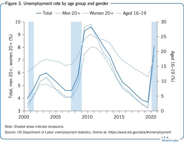
This relatively low teen unemployment rate looks good in comparison to many other Western and especially Mediterranean economies. It is still, however, far higher than desirable, especially coupled with the higher long-term unemployment among teenagers that had been observed at previous business-cycle peaks. (In 2019 teenagers unemployed for 27+ weeks accounted for the same share of the unemployed as among adults; in 2007 they accounted for a far lower fraction than among the unemployed generally.) This peak-to-peak increase is especially disturbing, as it suggests that there is an increasingly large group of Americans who are beginning their work lives with long-term disappointment and with dim career prospects.
Figure 3 also presents, along with the aggregate unemployment rate, the unemployment rates of adult men and women. Until the mid-1980s the unemployment rate of adult women had exceeded that of adult men [4]; since then, they have been roughly equal. The male unemployment rate even rose above that of women during and after the Great Recession because of the concentration of the downturn in more male-intensive industries, such as manufacturing. In the Covid Recession, however, adult female unemployment exceeded male unemployment because of the concentration of the recession in service industries.
The nature of work
Because of workers’ and employers’ reactions to the risk of infection by Covid, and because of government-mandated lockdowns, the location of work has shifted from offices to homes. Without going into the effects of this massive change on family relationships, child care, education, and others, it is important to think about how this shock to work life will change, perhaps permanently, workers’ preferences and employers’ vision of how to structure work. With many more workers suddenly performing most of their activities away from an office, permanent changes may be seen in the location of work and in how time is used. These cannot be gauged from the temporary changes during the recession; but the shock may well have ripple effects onto the entire structure of work, and perhaps also onto people's willingness to work, onto labor force participation, and hence onto unemployment and even wage levels and the structure of wages.
Wage developments
The calculations in this and subsequent sub-sections are all based on the analysis of individual data collected in the monthly Current Population Survey (CPS) and released as part of the National Bureau of Economic Research's Merged Outgoing Rotation Groups (MORG). All of the calculations are based on the usual weekly earnings of full-time workers (those usually working at least 35 hours per week); but including all workers, even those with very short workweeks, changes no conclusions. Using only full-time workers has the advantage of abstracting from changes that arise because of the changing prevalence of part-time work, both secular and cyclical developments. It thus concentrates on people who might be viewed as closely attached to the labor force and who have been the focus of much of the research on changing wage inequality, going back to [5] and [6].
This focus is on the economic well-being of full-time workers since 2000. An alternative, focused on the price of an hour of labor to employers rather than on the returns to workers, would calculate the wage (better still, the total payroll cost) of the average hour of labor used each year. The choice here is arguably more appropriate in an examination of inequality in the labor market.
Aggregate developments
Policymakers and even the average citizen correctly consider changes over time in the economic well-being of typical workers after accounting for inflation. Regrettably, no single measure would be universally agreed upon as reflecting these changes. There are two central issues:
Should the focus be on the earnings of the average worker, or on those of the median worker (the worker at the 50th percentile of earnings)? Using the average worker has the advantage of reflecting outcomes for workers as a whole, but it will miss changes caused by differential changes in earnings at various points of the earnings distribution. Using the median worker's earnings avoids the latter difficulty but vitiates the former advantage.
The aim is to measure economic well-being, but for that inflation needs to be accounted for. This requires deflating nominal earnings to obtain real earnings. The Consumer Price Index for All Urban Consumers (CPI-U) is the standard deflator, used, for example, in indexing various pension and retirement benefits, including federal Social Security payments. It has long been known, however, that it overstates the rate of increase of prices facing consumers [7]. A better alternative is the Personal Consumption Expenditure (PCE) deflator from the US national accounts.
Being agnostic about these two pairs of issues, in Figure 4 the real (2009 dollars) usual weekly earnings of full-time workers are presented, both at the mean and the median, and using both price deflators. Comparing changes from 2000 to 2019 is sensible, as these two years were, more or less, at the same stage of business cycles—representing full employment. Regardless of the wage measure or price deflator used, there is no doubt that workers’ real earnings rose over this period—and rose steadily from 2014 through 2019. But the differences in inferences across these four real measures are substantial: using the average worker's earnings deflated by the PCE deflator suggests an annual growth rate of 1.0%; while using the median worker's earnings deflated by the CPI-U suggests only half the growth rate, 0.5% per annum.
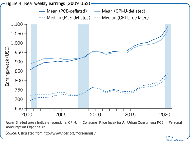
Looking at Figure 4 without thinking about the underlying details might suggest real earnings rose sharply during the Covid Recession—by about 5%, far larger than any previous annual increase. This is, however, an artifact of the uneven impact of the Covid Recession on hours of work, with short hours experienced disproportionately by workers with low hourly earnings. Those workers whose work time was not cut were mainly those with above-average pay.
Changing earnings inequality
Economists have concocted numerous different ways of measuring inequality in distributions of earnings and income. Each can present different pictures of how a distribution has been changing over time. Here the ratios of earnings of pairs of individuals at different points of the distribution of weekly earnings of full-time workers are chosen. In particular, the 90–50 ratio (earnings at the 90th divided by earnings at the 50th percentile), the 90–10 and 50–10 ratios are presented. This gives a fairly complete picture of the distribution of earnings. It would be useful to go above the 90th percentile of earnings, given the evidence that a substantial part of the change in income inequality in the US has been at the very upper end of the income distribution [8]. This is not possible with the CPS-MORG, as earnings above a certain weekly amount are top-coded (in 2020 amounting to 6% of the workers in the survey).
Consider first the 50–10 ratio, whose time path from 2000 through 2020 is presented in Figure 5. While there have been minor fluctuations, it has changed very little over the two decades: earnings inequality in the lower half of the distribution of earnings has fluctuated but overall been essentially unchanged.
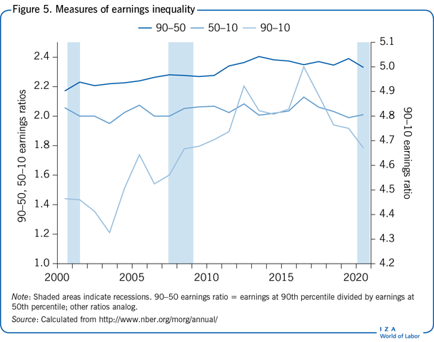
The bigger changes in inequality are shown by the paths of the 90–50 and 90–10 ratios. The first rose by 7%, and the 90–10 ratio by 5% from 2000 to 2020. By inference, wage inequality in the US continued to increase over this period, although there has been some narrowing in the past three years. Comparing these three ratios shows that the entire increase since 2000 has taken pace in the upper half of the earnings distribution. Most important, earnings inequality increased over the first half of this period, continuing a rise that began in the 1970s.
Female–male earnings differences
Differences in earnings by gender are often depicted for the entire working population. This can be misleading since it can confound variations arising from changing racial/ethnic earnings differences due to changing work hours and employment by racial/ethnic group with the gender differences that are of interest. To circumvent this potential problem, in addition to showing the overall female–male earnings ratio, Figure 6 also shows the paths of the ratios of female–male weekly earnings for full-time workers separately by racial/ethnic group: Non-Hispanic whites; African-Americans; non-black Hispanics, and Asian-Americans. Included in the group of All Workers are the 2% of the full-time work force who classify themselves as being of other or mixed races and are not included in the four groups for whom female–male wage ratios are graphed separately. If Figure 6 were re-drawn based on medians rather than averages, it would look very similar.
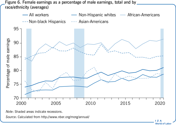
The most important conclusion from the figure is the general rise in female compared to male earnings that has taken place over these years, a roughly seven percentage point increase in women's relative earnings among all full-time workers. While these are still far from equal, they are much closer than they were as recently as the late 1990s.
The intra-racial/ethnic changes in female–male earnings differences are quite diverse and demonstrate the value of disaggregating the national averages. Not surprisingly, given that they are the majority in the work force, changes in female–male earnings among non-Hispanic whites parallel those in the aggregate: white women's earnings have been rising relative to those of white men, at a slightly faster rate than in the entire full-time work force. Among the smaller racial/ethnic groups the picture is more mixed: African-American women's earnings are the highest relative to men's earnings of all four racial/ethnic groups; and the ratio has risen at about the same rate as has been observed among non-Hispanic whites. Among non-black Hispanics the ratio has shown no clear trend: among Asian-Americans, women's relative earnings over the 20-year period have increased much more slowly than among majority workers. The bottom line is that the substantial increase in women's earnings relative to men's in the entire workforce over this period has been generated by changes within the majority population and among African-Americans.
Racial/ethnic earnings differences
Among full-time workers in 2020, 13% were African-American, 16% non-black Hispanic, and 7% Asian-American (and 2% other groups). With over one-third of the full-time work force now belonging to a minority racial/ethnic group, and with the role of race/ethnicity in US history being crucial, it is worth examining how wage differences between these groups and non-Hispanic whites have changed. It is well known that members of the first two groups earn less than majority workers. But how have these differences changed during the first two decades of the 21st century?
These comparisons are shown in Figure 7, with each line showing the ratio of the earnings of full-time workers in the particular minority group to those of majority workers. Rather than presenting separate graphs for men and women, each line presents a fixed-weight average of the male and female minority/majority earnings ratios (with weights of 0.55 and 0.45 to reflect more or less the gender representation in the full-time work force), thus abstracting from any changes in the gender mix of the full-time work force by racial/ethnic group. Note first that, as has been true historically, both African-Americans and non-black Hispanics earn less in full-time work than do non-Hispanic whites. On the other hand, throughout this period the earnings of Asian-American full-time workers exceeded those of majority workers.
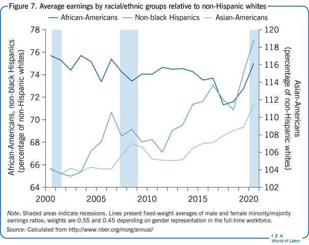
The time paths of racial/ethnic earnings differences over the past 20 years have been strikingly different from each other. African-Americans’ already low earnings relative to those of majority whites have fallen very slightly. Non-black Hispanics, on the other hand, while still earning less than African-Americans, have seen their earnings rise by almost six percentage points relative to those of majority workers. The biggest changes have come among Asian-Americans: even in 2019 full-time Asian-American workers earned 15% more than majority workers, an increase of 11 percentage points since 2000. This advantage skyrocketed during the Covid Recession, as workers in this group were much less likely to experience reduced work hours than were majority workers.
Limitations and gaps
Perhaps the biggest gap in any description of recent developments in the US labor market is in the area of earnings inequality. The top-coding of usual weekly earnings in the CPS has been fixed at $2,884 since the late 1990s. As nominal earnings have risen, this has meant that the reported weekly earnings of an increasing percentage of full-time earners have been top-coded. This limitation prevents nearly contemporaneous data on earnings near the very top of the distribution from being obtained, even though retrospective evidence from other sources, for example [8], indicates that, at least through the first decade of the century, much of the increase in inequality has been at this very high end. The annual American Community Survey avoids most of this difficulty, but even it top-codes earnings; and its data are only available with a one-year lag.
Summary and policy advice
The Covid Recession caused a huge increase in unemployment. As of this writing the US is still experiencing its labor market effects, although unemployment has fallen back to levels of milder recessions. The most important questions, which are not reflected in statistics on unemployment, labor force participation, real earnings, or inequality, are what the longer-term effects of this recession will be. Will people refuse to work at offices, to commute, without compensation for the disamenities of work that they have been able to avoid by working at home during the recession? Will labor force participation rise back to its 2019 level or even further, to its 2000 level? What should US governments’ policy responses be to long-term labor market changes induced by the shock of this most unusual recession?
Numerous desiderata about policy are suggested by the findings presented here. The continuing rise in earnings inequality is the biggest difficulty in the US labor market; and the rise has been generated by the more rapid growth of earnings in the upper part of the earnings distribution. The solution to this problem is simple and would put the US economy more in line with those of other wealthy nations: raise tax rates on households in the upper third of the distribution of household incomes (since the American income tax system is household rather than individual-based). This is the opposite of what was done in the Trump tax cuts of 2017, but matches proposals made early in the Biden administration. This could even be done without enlarging the historically high federal deficit or raising marginal tax rates, by sharply lowering the already very high taxable incomes at which the highest income tax rates become effective, while at the same time lowering rates on households in the bottom two-thirds of the income distribution. Since the labor market continues to generate increasing earnings inequality, these effects could be offset by tax policy affecting income inequality. The solution is clear and the difficulty is likely to persist.
Acknowledgments
The author thanks Martin Guenther, Michael Simmons, and Yonah Meiselman for their assistance. Version 3 of the article updates the content to 2020.
Competing interests
The IZA World of Labor project is committed to the IZA Code of Conduct. The author declares to have observed the principles outlined in the code.
© Daniel S. Hamermesh