Elevator pitch
Economists use various metrics for measuring income inequality. Here, the most commonly used measures—the Lorenz curve, the Gini coefficient, decile ratios, the Palma ratio, and the Theil index—are discussed in relation to their benefits and limitations. Equally important is the choice of what to measure: pre-tax and after-tax income, consumption, and wealth are useful indicators; and different sources of income such as wages, capital gains, taxes, and benefits can be examined. Understanding the dimensions of economic inequality is a key first step toward choosing the right policies to address it.
Key findings
Pros
The Lorenz curve is a commonly used metric that allows for the quick and visual comparison of inequality across countries.
The Gini coefficient uses information from the entire income distribution and is independent of the size of a country’s economy and population.
Percentile ratios are easy to calculate and focus on a specific region of the distribution.
The Theil index can decompose inequality into within- and between-group inequality.
These commonly used measures are generally in agreement when comparing inequality across countries.
Cons
If Lorenz curves cross they cannot provide a conclusive ranking between distributions.
The Gini coefficient values change depending on what is measured—wages, before-or after-tax income, wealth, or consumption.
Percentile ratios fail to use all information since they ignore incomes between percentiles.
The Theil index is less intuitive and not directly comparable across populations with different sizes or group structures.
The evolution of inequality within a country can appear different depending on the metric used.
Author's main message
Despite the relative strengths and weaknesses of the available measures, empirical studies show that they are mainly in agreement when comparing inequality differences across countries. However, the evolution of inequality within a country or the effectiveness of a specific policy can be perceived differently depending on the specific metric under consideration, as well as what variable is being measured. For instance, if policymakers care more about what happens to the poor they should use the Palma ratio instead of the Gini coefficient as their inequality measure and focus on consumption instead of income data.
Motivation
There are many reasons why policymakers and researchers alike are concerned with a country's degree of economic inequality. Recent studies show that persistent income disparities among individuals are associated with poverty and deprivation, mental illness, social unrest, and crime, as well as lower levels of education, employment, and life expectancy [1]. Many public policies such as taxes, welfare benefits, provision of education and health services, price, and competition regulations have distributional implications for income.
How equally is income distributed across individuals in countries with different social institutions, education systems, capital, and labor markets? How has inequality evolved over time? How have income distributions changed after tax reforms or financial crises? To be able to answer these important questions, a consistent measure of inequality is needed.
Discussion of pros and cons
Dimensions of economic inequality
Before choosing a particular metric, a decision must be made about the dimension of economic inequality to be measured. This choice is important, not only from a conceptual point of view, but also because it determines what instruments are available to policymakers trying to correct a given distribution. The discussion in this article focuses on inequality in outcomes, as opposed to inequality of opportunities (such as access to education, skills, and other limitations imposed by parental circumstances or belonging to a low socio-economic class). While the latter is undoubtedly important for understanding the factors behind economic inequality, especially in the context of social mobility, this article relies on more readily observable indicators of living standards, such as income and wealth. Many of the measuring techniques described below, however, can be applied to inequality in education, health, happiness, and life satisfaction in general.
When looking at disparities in income among individuals, it is necessary to distinguish between income, wealth, and pay inequality. “Pay inequality” refers to differences in wages paid to different people. This inequality can reflect differences in productivity of workers (e.g. between low- or high-skilled workers), labor market discrimination between groups, or differences in the nature of the job (e.g. miners and sales assistants).
“Income inequality” is the extent to which income is distributed unevenly across people or across households. Income encompasses labor earnings (such as wages, salaries, and bonuses), capital income derived from dividends, interest on savings accounts, rent from real estate, as well as welfare benefits, state pensions, and other government transfers. In addition, it is possible to distinguish between individual versus family income, pre-tax versus after-tax (disposable) income, and labor earnings versus capital income.
The third dimension of economic inequality is differences in “wealth” distribution. While income refers to the flow of money over a given period (say, a year or a month), an individual's wealth represents the stock of all assets that a person holds. These include financial assets, such as bonds and stocks, property, and savings. Income and wealth are not perfectly correlated. For instance, a high earner might be in the upper end of the income distribution while being relatively poor in terms of assets; likewise, an elderly worker might have accumulated substantial wealth (e.g. owning a house) but have low labor earnings. Different policies ranging from income and inheritance taxes to government schemes for first-time home buyers will affect different groups of individuals and might have opposing effects on wealth and income distributions.
Consumption versus income inequality
Some economists argue that “consumption” is a more appropriate indicator of persistent inequality as it is closely related to permanent income [2]. Consumption inequality is typically lower than income inequality because individuals can smooth temporary shocks to income (such as a temporary layoff or the end of a seasonal job) through saving and borrowing. Disparities in consumption better reflect differences across individuals in the accumulation of assets, access to credit, or the social safety net. Recent studies use the link between income and consumption variation to quantify the role of assets, taxes, transfers, and family labor supply in insuring against permanent income shocks [3], [4].
In practice, the choice between income or consumption measures is often determined by data availability. Advanced economies tend to collect high-quality income data, especially those drawn from administrative tax records. Consumption data are particularly relevant for developing countries, where it is difficult to obtain reliable estimates of income because a large part of the population is self-employed, producing for their own consumption (especially in agriculture), or being paid in kind. For this reason, World Bank Development Indicators on inequality for the least developed countries are typically estimated on household consumption expenditures.
Studies that look at the joint analysis of consumption and income data suggest that, while the level of inequality in consumption is typically lower than in disposable income, the overall ranking of countries is similar under both measures [5]. At the same time, the question of whether consumption inequality tracks income inequality over time has been a subject of debate, with mixed empirical results that differ depending on the data sources and methodology used (see [2] for a literature survey based on US data).
Unit of measurement
Another important issue for inequality statistics is the unit of measurement—whether it is an individual, a tax-paying unit, a family, or a household. Given that income is often shared within a family or a household, it might be more appropriate to look at disparities in household income, as opposed to individual income. Typically, earnings dispersion among households is lower than among individuals because of income pooling within the household, as well as the fact that families can provide insurance against individual risks (e.g. a worker increasing their labor supply in response to the job loss of their partner). The role of this family insurance mechanism has increased over time due to a rise in female labor force participation [3], [6].
When measuring household inequality, the fact that larger households face greater costs, while at the same time benefit from economies of scale in consumption should be accounted for. That is, a couple living together spend more on housing, utilities, clothing, food, and transportation than a single individual, but not necessarily double the amount. Hence, to account for differences in households’ size and composition across countries and over time, the official inequality statistics are often based on equivalized disposable income or consumption. That is, total household income or consumption is divided by the number of “equivalent adults” using an equivalence scale. The most commonly used scale is the square root of the household size, implying that the costs increase with size at a diminishing rate. An alternative scale used by the EU Statistical Office (EUROSTAT) is the modified-OECD equivalence scale that distinguishes between adults and children by assigning a weight of 1 to the household head, 0.5 to the second and each subsequent adult, and 0.3 to each child.
While using equivalence scales accounts for differences in household size across countries, it ignores changes in family demographics. A well-established fact in the literature is positive sorting patterns in marriages (e.g. highly educated men are more likely to marry highly educated women) [7]. An increase in the degree of this assortative mating will exacerbate income disparities between households, even if differences across individuals stay the same. Overall, differences across countries in household size and structure, as well as the choice of an equivalence scale, will affect international comparisons of household inequality.
The relationship between pay inequality and inequality in household disposable income or consumption varies across countries due to differences in the family structure, labor force participation, and the way the government operates. For example, one can compare pre-tax and after-tax income inequality to assess the effectiveness of a country's taxes and transfers at compressing income variation between people. The choice of a specific measure of inequality will thus depend on the purpose of the exercise.
How is economic inequality measured?
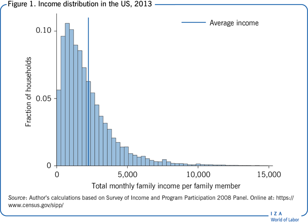
In essence, measuring inequality involves comparing income or wealth distributions across countries or over time. Figure 1 presents a distribution of family income per person across households in the US. The skewed shape with a long right tail is typical for income distributions. That is, most households earn below the average with a few households earning a very high income. Measures of inequality attempt to capture the dispersion, or the spread, of this distribution.
To be able to compare income distributions across countries and over time, inequality measures need to satisfy the following four criteria [8]:
Anonymity principle: all permutations of personal labels within a given distribution (i.e. who earns what), should not affect overall inequality.
Population principle: inequality measures should be independent of the size of the economy. That is, if an economy is cloned then the extent of inequality in the combined economy will stay the same as in the original one. In that way, it is possible to compare small and big countries irrespectively of their population size or their aggregate income.
Relative income principle: only relative income should matter, not income levels. If income increases by a constant proportion for everyone (say, due to economic growth) then inequality is unaffected as long as the relative standing of individuals in the income distribution stays the same.
Transfer principle (or Pigou-Dalton principle): inequality is reduced when a fixed amount is transferred from a richer individual to a poorer individual (and the recipient is still poorer than the donor).
Lorenz curve and Gini coefficient
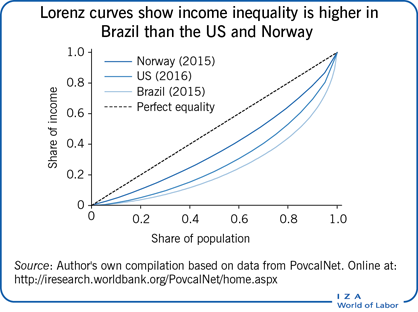
The “Lorenz curve” is a common graphical method of representing the degree of income inequality in a country [9]. It plots the cumulative share of income (y axis) earned by the poorest x% of the population, for all possible values of x (see the Illustration for a practical example). The 45-degree line represents the line of equality, when income is shared equally among all individuals. If, however, income is not shared equally, then the bottom x% of individuals earn less than x% of total income in the country, implying that Lorenz curves typically lie below the 45-degree line. Moreover, the further away the Lorenz curve is from the equality line, the more unequal the income distribution.
The Illustration shows Lorenz curves for three countries: Brazil, Norway, and the US. In the US, for instance, the poorest 10% of the population get about 1.6% of the total income, the poorest 20% get 5%, and so on. If one Lorenz curve lies below another then the former distribution is more unequal. In the Illustration, a clear ordering is apparent, with Norway being the most equal and Brazil being the most unequal of the three. However, if Lorenz curves cross they cannot provide a conclusive ranking between distributions. This happens, for example, if in one country the people in the bottom part of the distribution are extremely poor but those in the middle and the top part are more equal (so that the lower segment of the Lorenz curve is further away from the equality line), while in another country the opposite is true and there is more inequality at the top (so that the upper part of the Lorenz curve is further away from the equality line). For this reason, a summary measure is needed that aggregates all this information into a single number to provide a complete ranking of distributions. Note, however, that different inequality indices might disagree in that ranking.
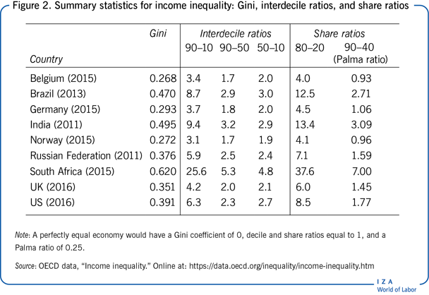
The most commonly used summary measure of economic inequality is the “Gini coefficient,” which is directly linked to the Lorenz curve [9]. The Gini coefficient is defined as the area between the Lorenz curve and the 45-degree line, divided by the total area under the 45-degree line. This inequality index (calculated in practice based on a formula) takes values between 0 (which refers to “perfect equality”) and the maximum value of 1 (when one person earns all the income). The lower the Gini value, the more equal a society is. For example, Figure 2 shows that the Gini coefficient for disposable household income ranges from 0.27 in Belgium and Norway to 0.62 in South Africa. Economies with Gini values above 0.5 are considered very unequal, with countries like Botswana, Colombia, and Zambia being in this group. A Gini coefficient below 0.3 is considered low and is typical for Scandinavian countries, as well as Slovenia, the Czech Republic, and Slovakia. In most countries the Gini coefficient lies between 0.3 and 0.5. In many advanced economies, there has been an increase in income inequality since the 1980s [10].
The Gini coefficient is independent of the size of the economy and the size of the population. Moreover, it follows the transfer principle: if income (less than half of the difference) is transferred from a rich person to a poor person, the resulting distribution is more equal. In addition, it uses information from the entire income distribution. This measure is not perfect, however, as economies with similar Gini coefficients can have very different income distributions. For example, consider an economy in which half of the population receive zero income, while the remaining half shares all income equally; and another economy in which three-quarters of the population earn one-quarter of total income, while the remaining one-quarter of the population receive three-quarters of the total income (split equally within the groups). Both economies have a Gini value of 0.5; however, it would be logical to consider the former country to be much more unequal as half of its population gets nothing. Note also that the value of the Gini coefficient will change depending on what is measured, for example, income inequality before or after tax, consumption inequality before or after housing costs, and so on.
Coefficient of variation and variance of log income
In addition to the Gini coefficient, there are other inequality measures that summarize information from the entire income distribution. Consider, for example, the “Coefficient of Variation” (CV) and the “Variance of the Natural Logarithm of Income.” The CV is equal to the ratio of the standard deviation to the average income. Since it measures variability relative to the mean, it is independent of the level of income. Similarly, the variance of log income is scale invariant. Both indices agree on the rank with the Gini coefficient when Lorenz curves do not cross but might differ in their ranking when they do.
In practice, the Gini coefficient puts a higher weight on the middle of the distribution, the CV is sensitive to the right tail of the distribution (the rich), while the variance of log income is more sensitive to the bottom part of the distribution (the poor). These measures might evolve differently over time and a different metric is preferable depending on the purpose of the exercise. For example, if the goal is to study poverty levels then the variance of log income might be preferable to characterize the less well-off individuals. On the contrary, when trying to analyze the concentration of wealth at the top of the distribution, it might be more appropriate to use the coefficient of variation.
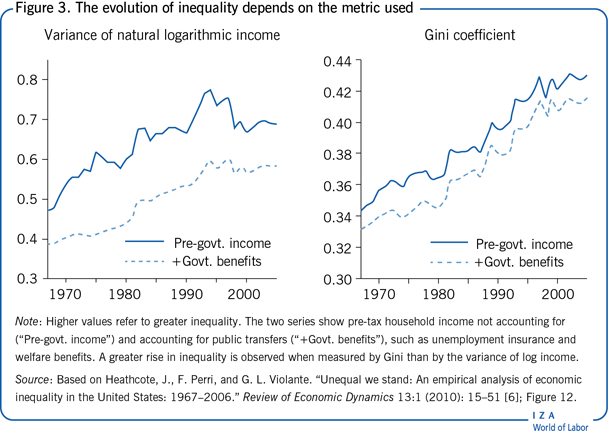
Figure 3 illustrates the differences between two inequality measures—the Gini coefficient and the variance of log income—based on US household survey data [6]. First, notice that the two measures evolve differently over time: while the Gini coefficient keeps growing steadily from the end of the 1960s to the beginning of the 2000s, the variance of log household income reaches its peak around 1994 and starts to decline afterwards. Second, the extent of inequality can differ depending on what is being measured. Accounting for government benefits in household income reduces inequality, and this reduction is much larger (i.e. the gap between the lines) when inequality is measured by the variance of log income. This is unsurprising, since public transfers play an important role in compressing inequality at the bottom of the distribution, while having little effect on the top.
Percentile ratios and share ratios
Each of the inequality measures considered so far takes advantage of the whole distribution. Other commonly used measures of inequality focus on specific points or regions of the distribution, such as the percentile ratios and the share ratios. Their appeal is that they are very intuitive and easy to calculate.
A commonly used percentile ratio, also called the “Interdecile ratio,” is the 90–10 ratio, which shows the income level of individuals at the top of the income distribution (top 10%) relatively to the income level of those at the bottom of the distribution (bottom 10%). For example, the 90–10 ratio in the US, calculated based on disposable household income, is 6.3 (Figure 2); this means that the income of the top 10% of households in the US is more than six times greater than that of the bottom 10%. This measure can be split into 90–50 and 50–10 ratios to study income disparity separately between the upper end and the middle, and between the middle and the lower end of the income distribution, respectively. For instance, Figure 2 shows that there is more inequality among the poor than among the rich in the US, while the opposite is true in India and South Africa. In a similar fashion, the 99–90 ratio (not shown in Figure 2) can be used to study the extreme right of the distribution by looking at the top 1% of earners [11].
A similar measure of income concentration can be obtained by looking at income shares of individuals at different parts of the distribution, for example, by dividing the population into quintile groups. Figure 2 reports also the “Interquintile share ratio,” 80–20, which shows the share of total income earned by the top quintile (top 20%) relative to the share earned by the bottom quintile (bottom 20%). This share equals 1 under a perfectly equal income distribution. In practice, however, the top quintile's income share is multiple times that of the bottom quintile—ranging from a factor of four in Belgium and Norway to reaching double digits in Brazil, India, and South Africa.
Another commonly used share ratio is 90–40, called the “Palma ratio” [12]. It represents a ratio of the income of the richest 10% of the distribution to those in the bottom 40%. The rationale for this measure is based on the empirical regularity that in most countries the upper-middle of the distribution (from the 4th to the 9th decile) earn about 50% of national income and that share is consistent over time and across countries [12]; therefore, changes in income or consumption inequality are (almost) exclusively due to changes in the share of the richest 10% and the poorest 40%. It is common to consider societies with a Palma ratio of 1 or below 1 to be relatively equal, meaning that the top 10% does not receive a larger share of national income than the bottom 40%. For example, the Palma ratio is below one in Benelux and Nordic countries, while reaching 7 in South Africa.
The benefits of using the percentile or share ratios is that they are transparent about what part of the distribution is driving the observed changes in the summary measure, which is more difficult to pinpoint when using the Gini coefficient. The downside of using interdecile ratios is that they ignore incomes between percentiles, as well as above the highest and below the lowest percentile. In addition, these ratios satisfy the transfer principle only weakly, that is, the overall measure of inequality does not increase when income is transferred from relatively rich to relatively poor individuals (e.g. it might stay the same if transfers happen within the percentiles of interest).
Theil index
The “Theil index” belongs to the family of general entropy (GE) measures that are based on ratios of incomes to the mean [8]. The most popular GE indices are Theil's L index, or mean log deviation, and Theil's T index that is often referred to as the Theil index. Both indices are equal to zero in the case of perfect equality and increase as the distribution becomes more unequal, but unlike the Gini coefficient they are not capped at 1. In fact, the Theil index is not a relative measure of inequality and thus its values are not always comparable across populations of different sizes or group structures. Another feature of these two indices is that Theil's L is sensitive to changes in the bottom of the income distribution, while Theil's T is sensitive to changes at the top. Thus, comparing the evolution of the two measures can be informative for identifying which part of the distribution is driving the observed changes in inequality.
While the Theil index does not have an intuitive explanation, it is often used in empirical studies because of its decomposability. That is, if the population can be divided into several sub-groups (e.g. based on age, education, regions, and so on) the Theil index can quantify how much of income inequality is due to differences across individuals within and between these groups. This is valuable for policymakers in trying to identify the sources of inequality. For example, the Theil T index can be used to decompose global inequality into between- and within-country inequality and show that about 70% of global inequality is explained by the between-country component [13].
To sum up, country rankings are similar across different measures of inequality [10]. However, the choice of a metric is important when analyzing the effects of a policy that might affect individuals at the top and at the bottom of the distribution differently. In addition, the evolution of inequality within a country over time might show a very different pattern depending on the measure used.
Limitations and gaps
To compare inequality measures across countries, researchers need to be mindful of cross-country differences in data sources and definitions. The data used to measure economic inequality typically come from household surveys and are particularly ill-suited for studying inequality at the very top end of the income distribution. The ultra-rich are less likely to answer questions about their income and its composition, and their responses might be top-coded to preserve anonymity. Instead, the recent literature uses administrative data obtained from tax records that is not censored from the top [10], [13]. Moreover, the source of income matters, as the measures derived from self-employment activities tend to be of much worse quality than wages and salaries. This is especially true for developing economies, which warrants the use of consumption expenditures data instead.
Another caveat of inequality research is the time frame. Most measures of inequality are static in nature, focusing on monthly or annual income. In that way, temporary shocks to income might lead to an overestimation of the degree of inequality compared to longer time horizon measures. Similarly, some cross-sectional income disparities reflect differences among individuals due to their age since these metrics are typically pooling together young inexperienced workers with workers at the top of their careers. These differences would disappear if individuals’ life-time incomes were compared instead. The issue of a time horizon is related to a bigger question of social mobility and inequality of opportunity in general. Being born to a less well-off family or growing up in a poor neighborhood have long-lasting effects on individuals and may trap them in poverty and persistent deprivation.
Summary and policy advice
Measuring inequality involves comparing income distributions across countries or over time. General ranking criteria applied to income distributions often result in indecisive conclusions; therefore, policymakers prefer a summary index of inequality that can be expressed in a single number. The most commonly used inequality measures are the Gini coefficient (based on the Lorenz curve) and the percentile or share ratios. These measures try to capture the overall dispersion of income; however, they tend to place different levels of importance on the bottom, middle and top end of the distribution.
When making international comparisons, most inequality measures generally agree on the overall ranking across countries. In this case, it is necessary to ensure consistency in the definition of income (whether it is household or individual, pre-tax or after-tax, income or consumption expenditures). On the other hand, if a policymaker's goal is to evaluate the effects of a specific policy or to examine the evolution of inequality over time then the choice of metric depends on the nature of the exercise at hand. For example, to analyze the effectiveness of government redistribution policies inequality in pre-tax and after-tax income should be compared. Moreover, it is more appropriate to use the Palma ratio or the interdecile ratios instead of the Gini coefficient as these measures are more sensitive to changes in income at the bottom part of the distribution.
Acknowledgments
The author thanks an anonymous referee and the IZA World of Labor editors for many helpful suggestions on earlier drafts.
Competing interests
The IZA World of Labor project is committed to the IZA Code of Conduct. The author declares to have observed the principles outlined in the code.
© Ija Trapeznikova